
Rebuilding Poster Maker’s dead tab into an AI studio people pay for.
I turned an overlooked Creation tab into a dedicated space for AI-powered creation inside Poster Maker.

Problem
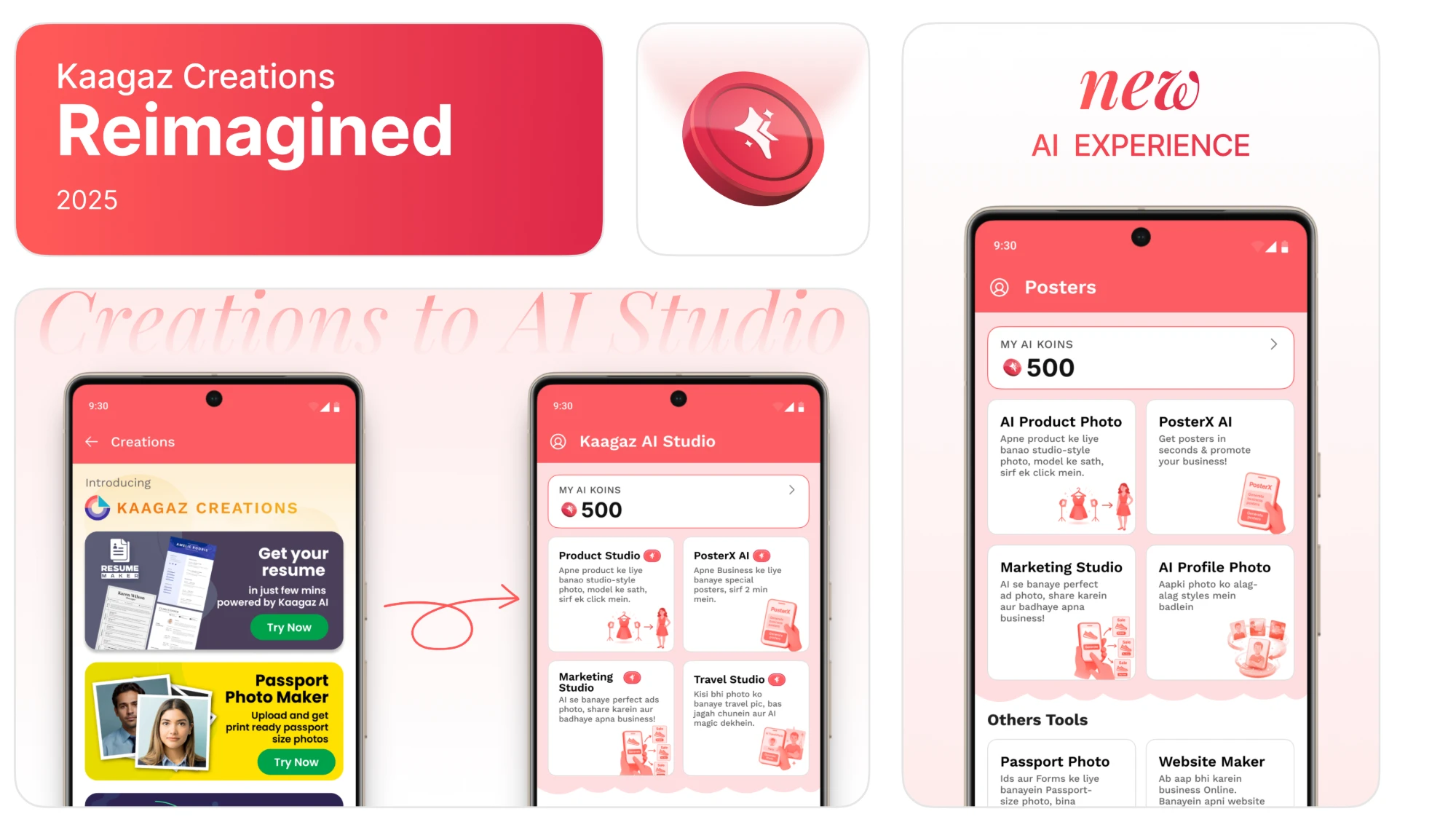
AI tools had no real home.
Poster Maker's Creation tab wasn't getting much attention. As Poster Maker started exploring AI features, there was an opportunity to bring them into the product in a more useful, accessible way.
What I did
I turned it into AI Studio.
I redesigned the Creation experience, brought AI tools together, and introduced Koins so people could access and pay for AI-powered creations in one place.

What shipped
A new way to create inside Poster Maker.
AI Studio became the home for PosterX and other AI tools, including Product Studio and AI Travel Photo, with a shared Koins credit system.
- Product
- Poster Maker by Kaagaz
- My role
- Product Designer
- Timeline
- 6 months · 2 releases
- Team
- 1 PM · 3 engineers · me
- What I worked on
- Product direction, information architecture, UX, visual design, AI tool integration and monetisation.
- Collaboration
- Worked closely with the PM and engineering team, with the CEO involved in pricing decisions.
Old experience
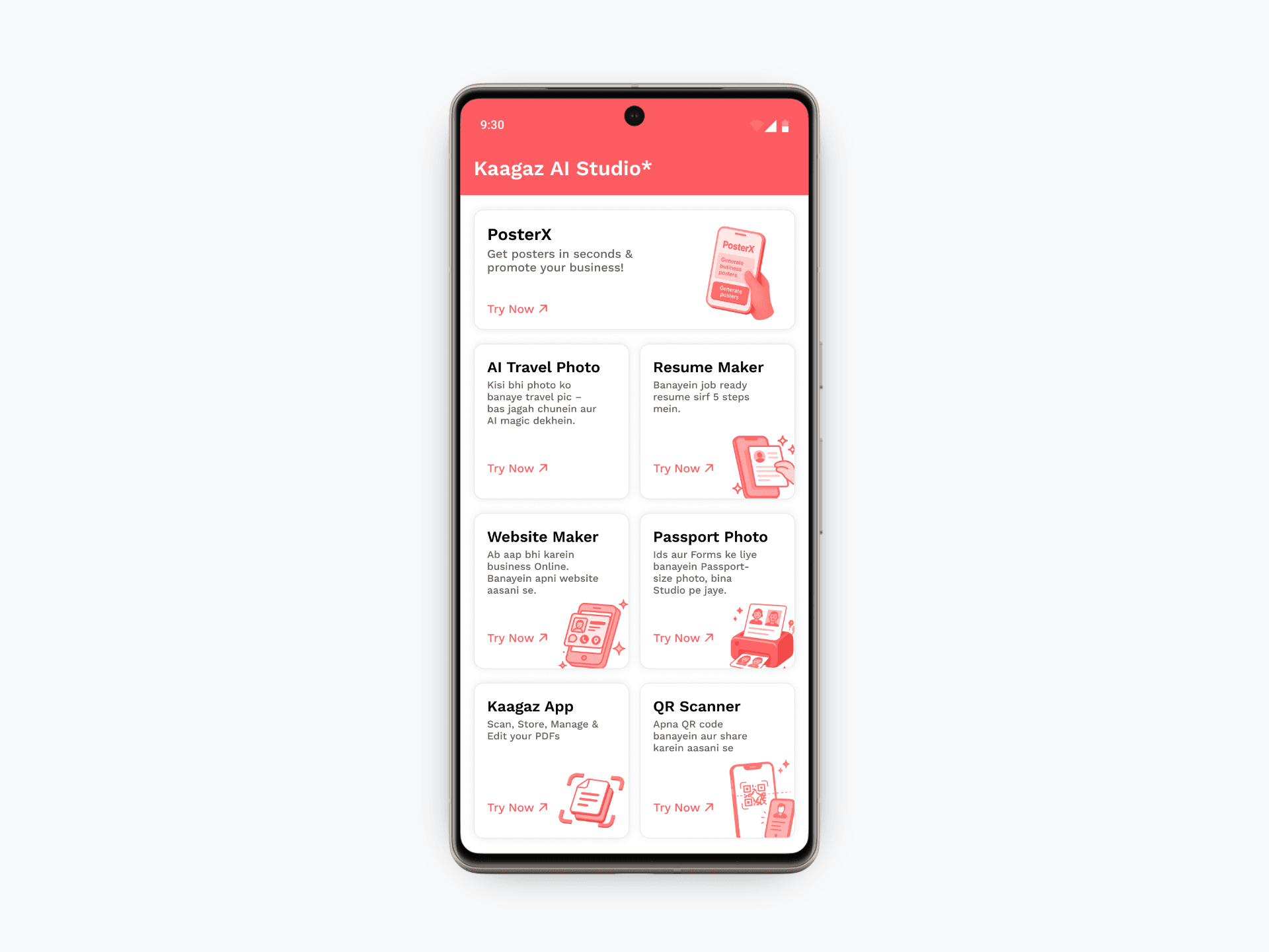
Poster Maker with a Creation tab full of unrelated tools
Poster Maker helped small business owners create promotional posters, festival greetings and everyday marketing material. But the Creation tab had gradually become a collection of utilities rather than a place to create.
- < 2%
- tapped the Creations tab
- 90%
- of them never opened it a second time
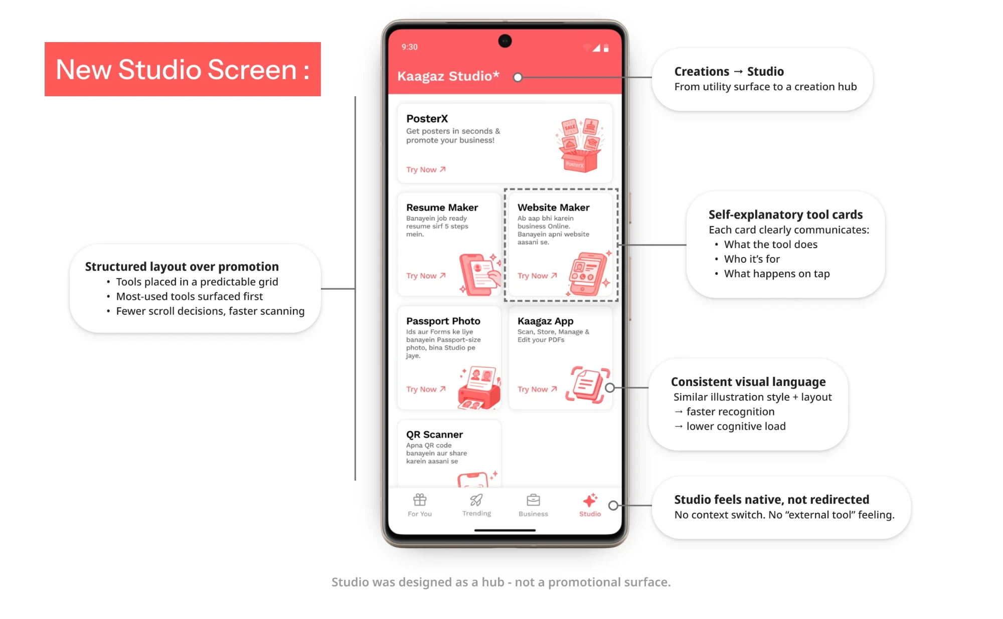
First redesign: Studio V1
From Creations to Studio
I replaced the promotional cards with a structured tool hub, giving each feature a clear purpose and a consistent place inside the app.
Design decisions
01Clearer identity
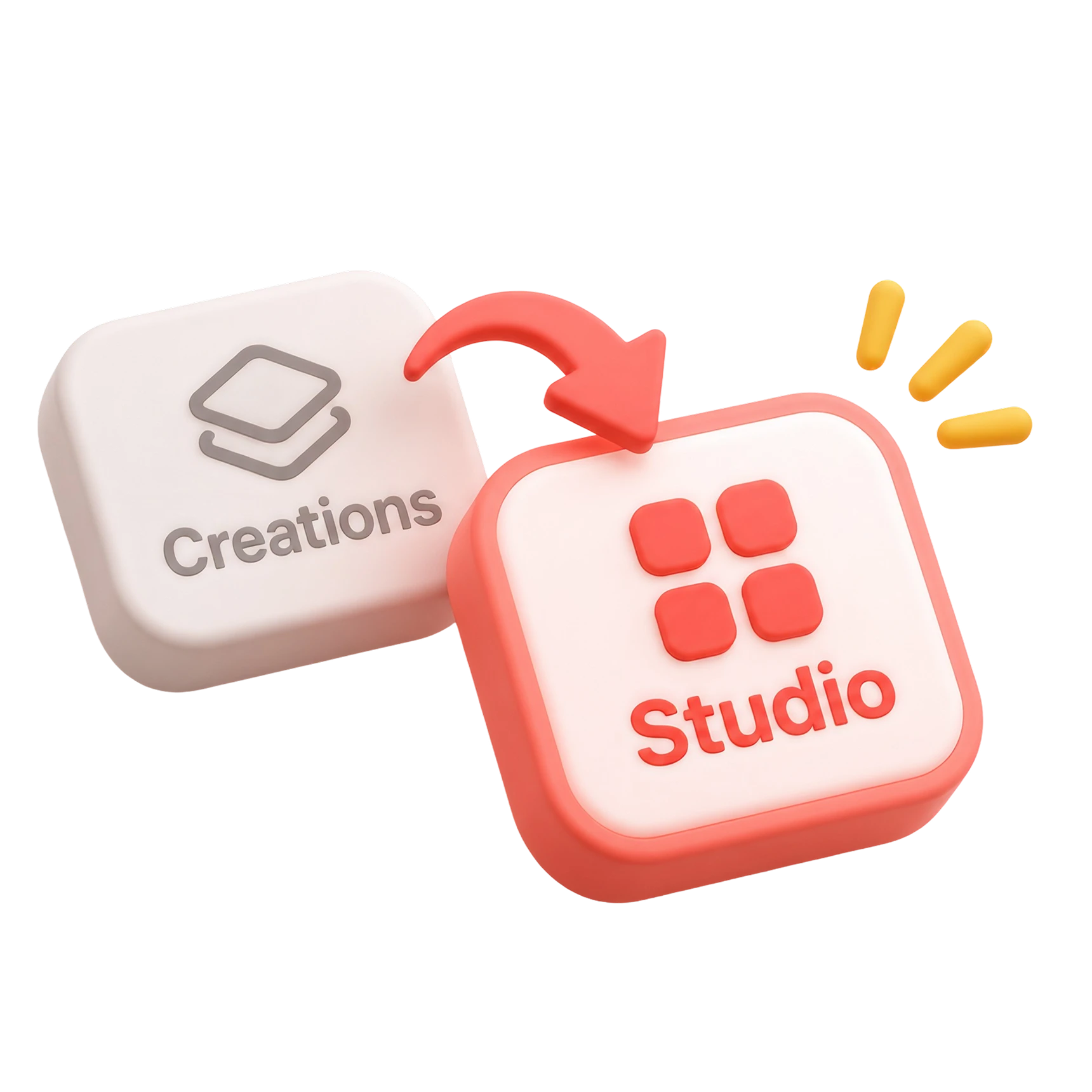
Renamed Creations to Studio to make its purpose easier to understand.
02Tools, not promotional banners
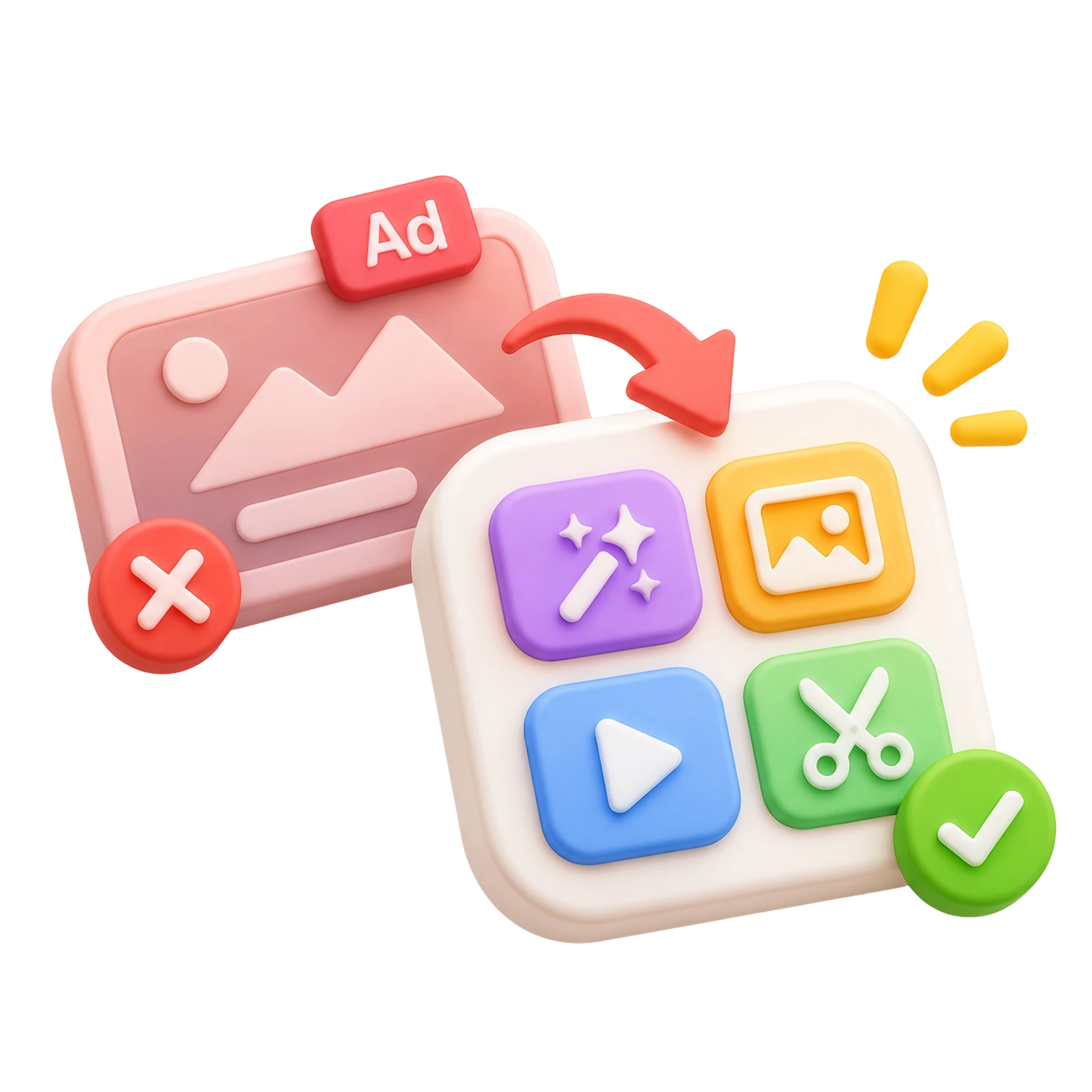
Replaced oversized promotional cards with compact, scannable tool cards.
03Consistent card system
Standardised illustrations, descriptions and actions so users could recognise how each tool worked.
Where V1 fell short
The layout was fixed. The product was growing.
Studio made existing tools easier to discover. But as we introduced more AI-powered features, the same grid started showing its limitations.
What I noticedWhy it mattered
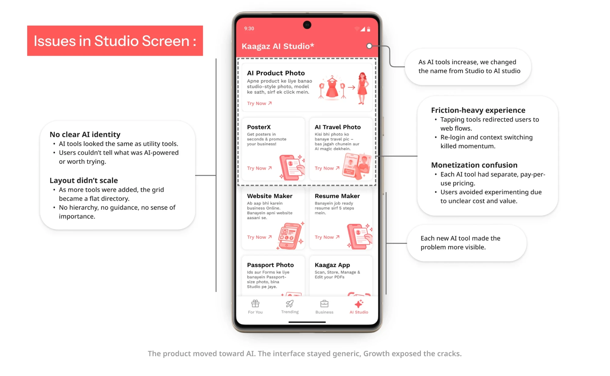
No clear AI identity
AI tools looked the same as utility tools, so nobody could tell what was AI-powered or worth trying.
The layout stopped scaling
Every tool we added made the grid a longer flat directory, with no hierarchy and no sense of what mattered.
Tapping a tool left the app
AI tools redirected out to web flows. Re-login and the context switch killed the momentum people arrived with.
Every tool priced itself
Separate pay-per-use pricing on each tool meant a fresh cost decision before every experiment.
Growth made all of it louder
Each new AI tool we shipped put the same four problems in front of more people.
Redesign strategy
Studio V1 made tools easier to discover, but it still treated them as separate utilities.
As Kaagaz moved towards AI-driven creation, we needed more than a better-looking screen. We needed an experience that helped users discover AI tools, understand their value, trust the pricing, and complete their work without leaving Poster Maker.
I shifted the focus from organising tools to building a unified AI creation experience.
Four strategic decisions
01From tool directory to creation hub
Organise the experience around what users can create, not just a growing list of utilities.
02Make AI easy to recognise
Give AI tools a distinct identity and priority, without making regular tools harder to find.
03Make pricing predictable
Replace fragmented tool-level pricing with one shared currency that users could understand across AI tools.

04Build for a growing set of tools
Create a flexible structure that could accommodate new AI experiences without making the screen harder to navigate.
Trade-offs
Three calls I would defend
The second redesign wasn't just about improving discovery. It involved decisions around monetisation, adoption, and how AI would fit into the existing product.
There wasn't one perfect solution. Each decision meant prioritising one thing over another.
One currency, not per-tool pricing
Why I chose it
A shared currency made the cost easier to predict and encouraged users to explore multiple tools without learning a new pricing model each time.
Gradual adoption, not aggressive promotion
Why I chose it
Many users came to Kaagaz for familiar poster-making tasks, not necessarily to experiment with AI. I chose to introduce AI more prominently without disrupting the workflows they already depended on.
Simplicity for users, complexity behind the scenes
Why I chose it
Users needed one balance, one pricing system, and a predictable experience wherever they created something. None of what it took to do that had to reach them.
Shipped
What we shipped
We shipped four major changes to turn Studio from a growing collection of disconnected tools into a structured AI creation experience. Each change addressed a specific friction point in discovery, usability, pricing, or scalability.
Brought every AI tool inside the app
The previous experience sent users outside Poster Maker to access AI tools. Every redirect added friction, interrupted the creation flow, and created another opportunity for users to drop off.
We brought the entire experience natively inside the app, from uploading assets to generating and downloading the final output.
Native AI creation flow inside Poster Maker.
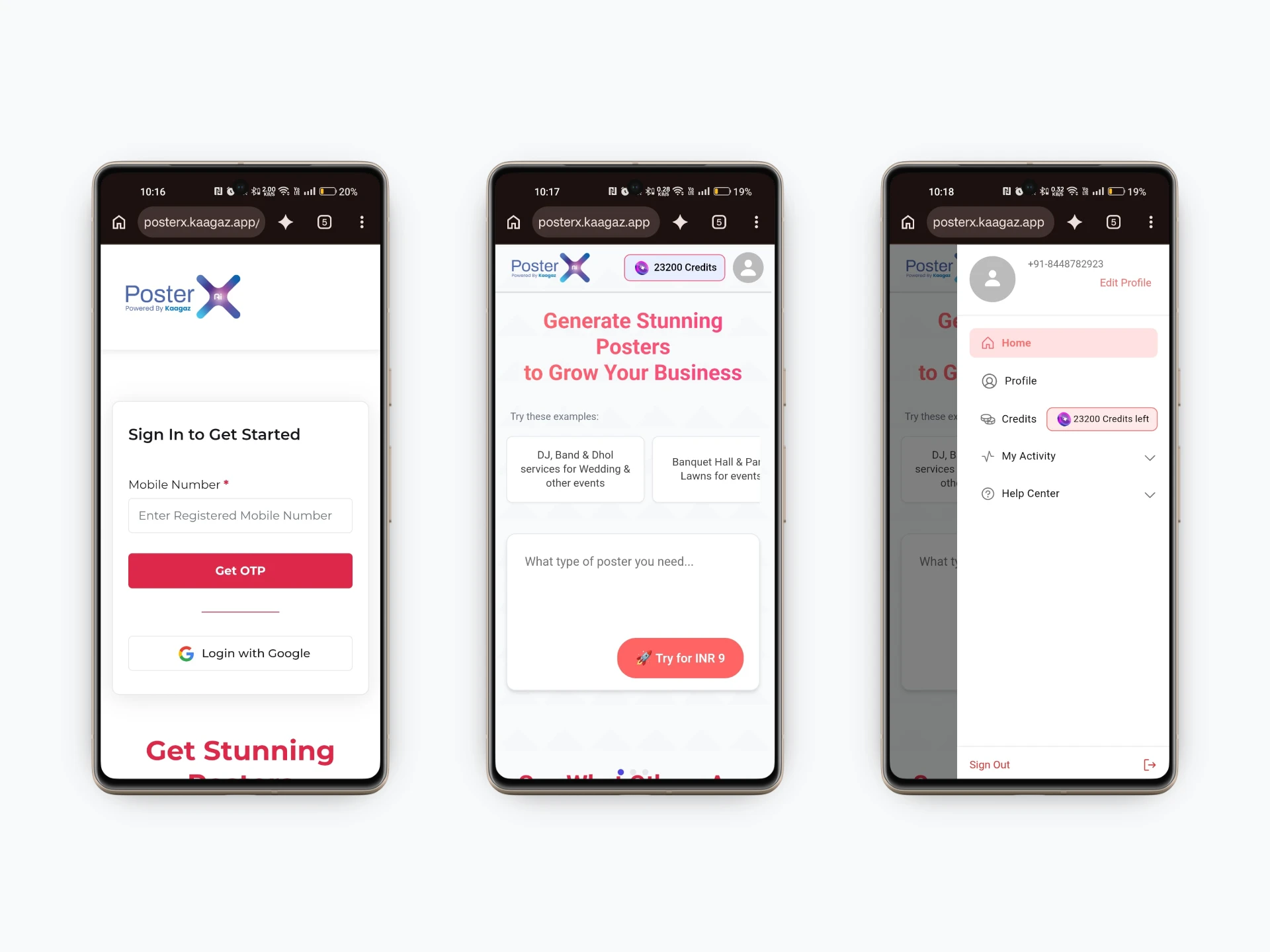
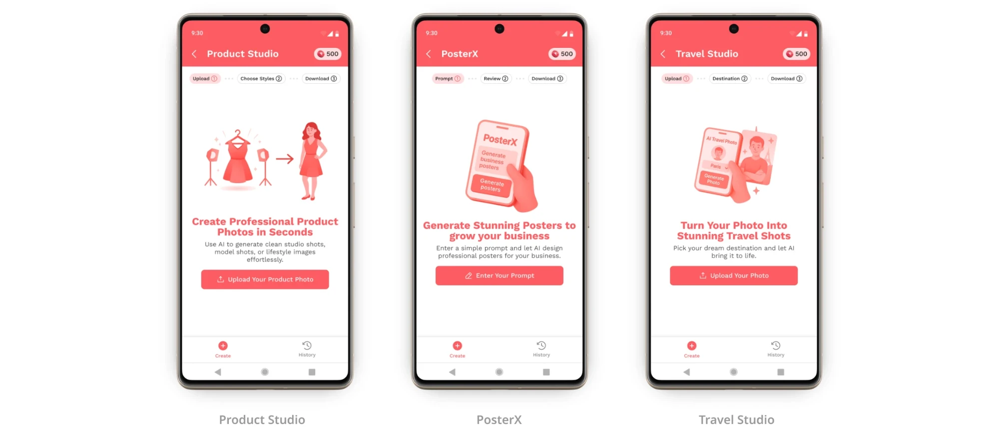
- Native upload and generation flow
- No external browser redirects
- One continuous creation experience
Gave AI tools their own identity
AI tools looked like regular utilities in the previous Studio grid. Users had no immediate way to distinguish AI-powered experiences from traditional tools.
We introduced a dedicated AI section, clear AI badges, and priority-based ordering to make these tools easier to recognise and discover.
Dedicated AI section with identifiable badges.
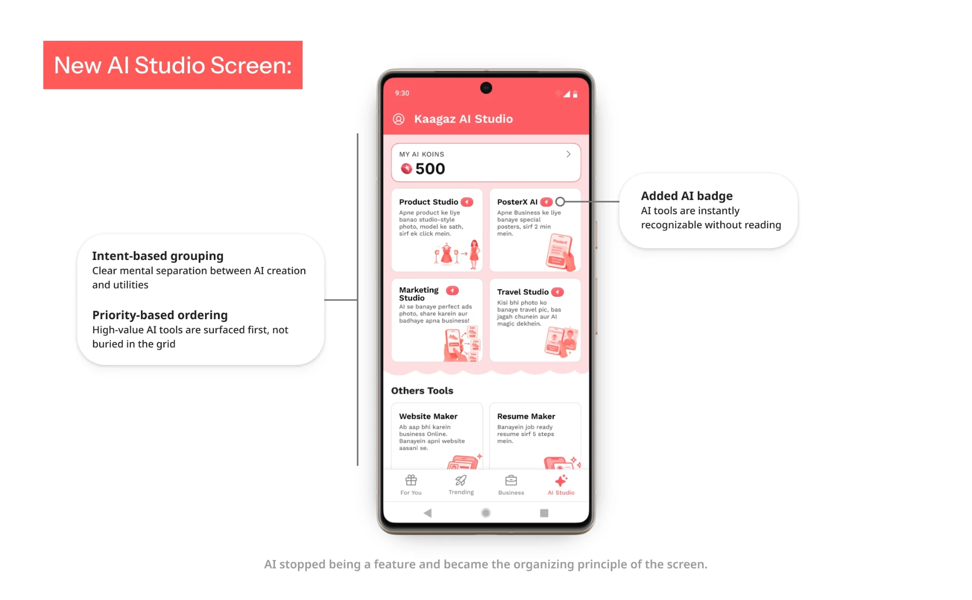
- Clear AI badge on every AI tool
- High-value AI tools surfaced first
- Non-AI utilities moved into Others
Replaced fragmented pricing with Koins
Each AI tool previously had its own pricing logic. Users had to understand different costs before experimenting with different creation experiences.
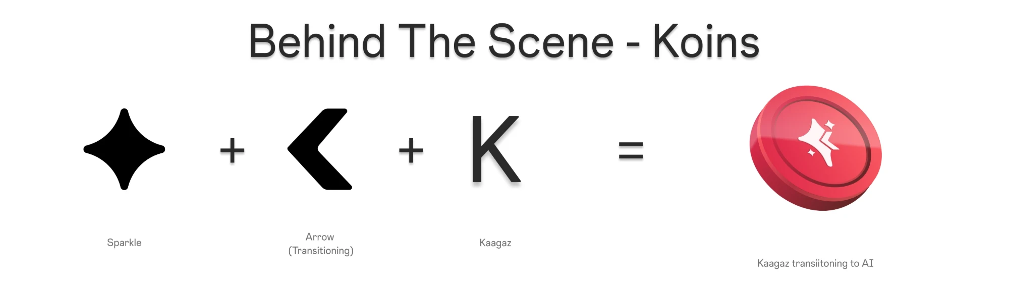
We introduced Koins as a shared currency across all AI tools. A single balance, consistent usage cost, and transaction history made spending easier to understand.
One currency, visible balance and history.
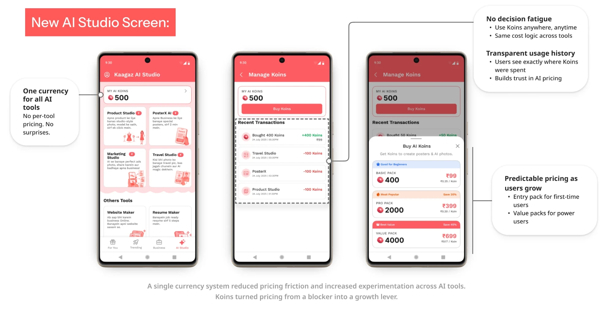
- One shared Koins balance
- Consistent 100 Koins per photo or action
- Transparent transaction history
- Recharge packs with clear pricing
Structured Studio to scale
As more tools were introduced, the original grid became increasingly difficult to navigate. Simply adding more cards would make discovery harder.
We redesigned the information architecture around two clear sections: AI Studio and Others. This gave users a predictable starting point while leaving room for future tools without overwhelming the screen.
Two structured sections with clear hierarchy.
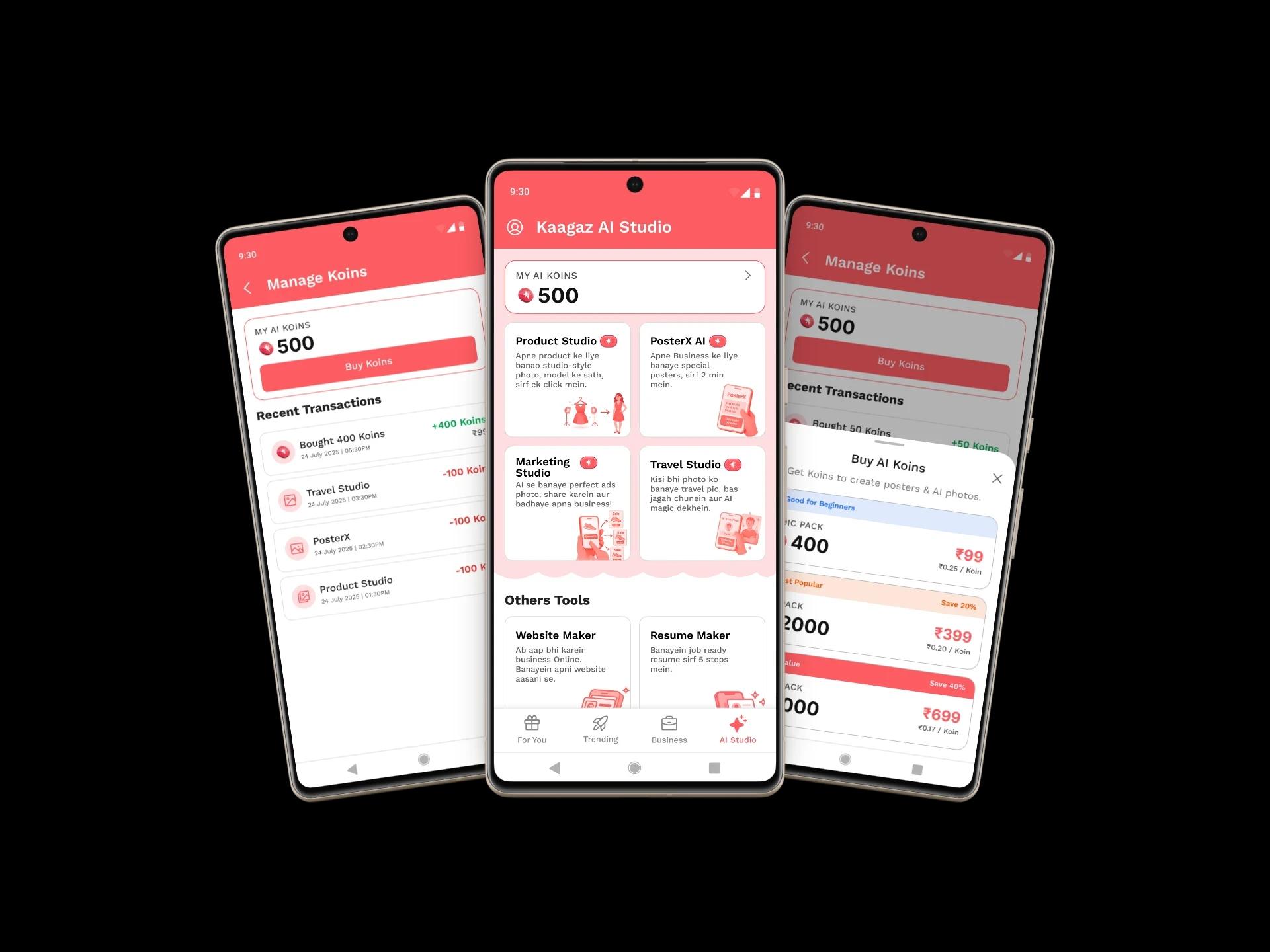
- Separate AI Studio and Others sections
- Consistent card dimensions and hierarchy
- Priority-based tool placement
- Scalable structure for future additions
Team
Who decided what
I owned the design end to end, but the product decisions were shared. My role was to build the design argument, challenge assumptions, and bring different constraints together before we shipped.
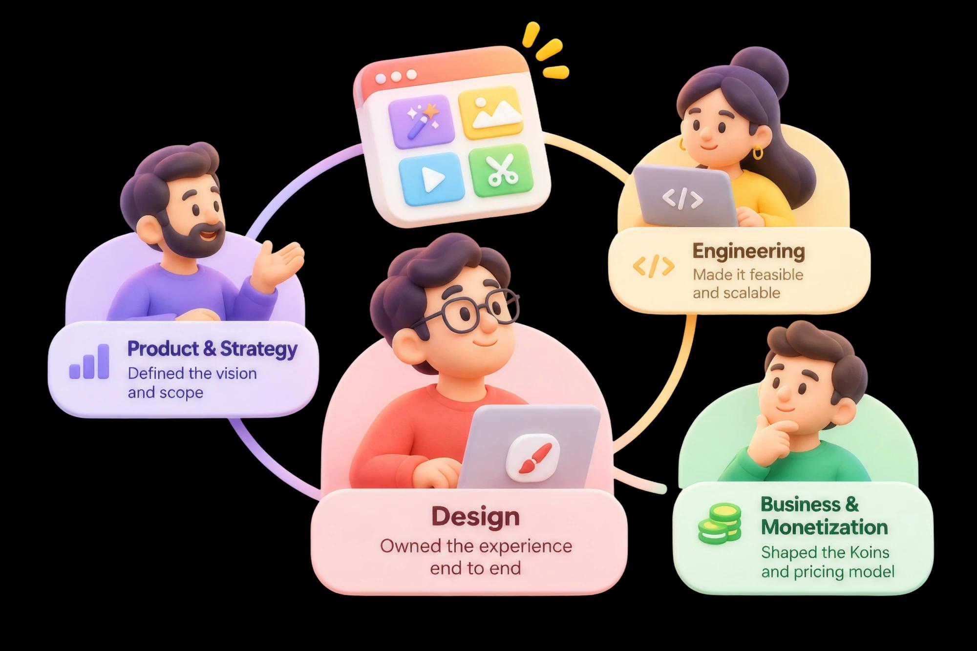
Where the decisions were made
Product and strategy
Which tools became AI-led, and in what order.
Worked with the PM to define which tools should become AI-led, which should remain utilities, and how the new Studio experience should evolve.
Engineering and feasibility
What the app could actually do, and at what latency.
Partnered with engineers to bring AI tools from external web experiences into the app. We balanced the intended UX against technical limitations, latency and infrastructure constraints.
Business and monetisation
What Koins had to earn, and over what horizon.
Worked with the CEO on the Koins direction, weighing predictable pricing and long-term user confidence against short-term revenue optimisation.
AI in my process
Where AI helped me think, not decide
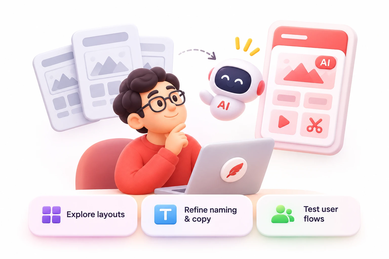
The product was AI-powered, but AI also became part of my design process. I used it to explore possibilities faster, challenge early assumptions, and test different scenarios before committing to a direction.
Where I used AI
Drafts, options and stress tests.
- Explored multiple Studio layouts and hierarchy options before finalising the structure.
- Refined tool naming and microcopy to make AI-powered experiences easier to understand.
- Simulated different user intents and edge cases to stress-test proposed flows.
Where I did not
Structure, pricing and the final calls.
- The information architecture and how tools were grouped.
- The pricing logic and the Koins model.
- The final interaction patterns and the product trade-offs behind them.
Impact
What changed beyond the interface
The redesign changed how users discovered, accessed and paid for AI tools. We did not run a controlled experiment to isolate the effect of each change, but we could observe improvements across product behaviour and monetisation.
Product experience
AI Studio became the place AI lives.
- AI Studio became the central entry point for AI-powered creation.
- Users could reach multiple AI tools without leaving Poster Maker.
- AI and utility tools became easier to tell apart.
- The new structure gave future tools a consistent place to live.
Monetisation
One balance, one way to pay.
- One shared Koins balance across AI Studio tools.
- Individual tool-level pricing decisions replaced by a consistent usage model.
- Credit consumption and transaction history made visible.
- A clearer purchase moment through predefined Koins packs.
User experience
Fewer decisions between intent and result.
- External redirects removed from AI creation flows.
- Fewer decisions when moving between AI tools.
- Tool capabilities and cost easier to understand before starting.
What held after both releases
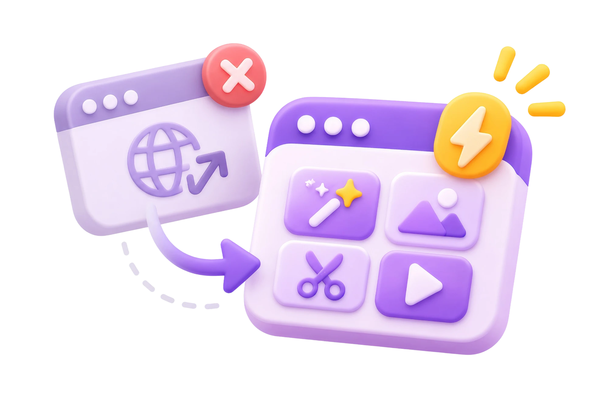
Native access
AI creation without a single external redirect.
Unified pricing
One currency across every AI Studio tool.

Clearer discovery
AI and utility tools in distinct, named sections.
Scalable structure
A repeatable system the next tool plugs into.
Learnings
Three things I carry forward
Visibility is not motivation
Moving the tools to the top of the screen made them easier to discover, and adoption barely moved. People were not failing to find them. They were finding them, not understanding what they cost, and deciding not to risk it.
A clean UI does not automatically build trust
Studio V1 looked better and held for about four months. Users still hesitated, because the hesitation lived at the external redirect and at the price, both outside the screen I had redesigned. Trust depends on the whole experience, not its visual presentation.
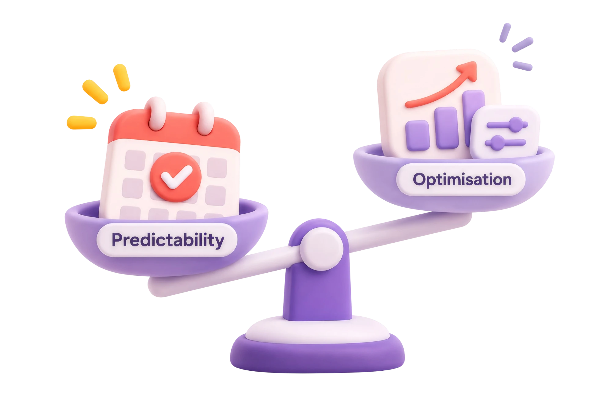
Predictability can be worth more than optimisation
Different prices for different tools created a decision every time. One consistent Koins system made experimenting easy to understand, even though it meant giving up some per-tool pricing flexibility.

The screens